Quick Apply Basic Graphic Components #
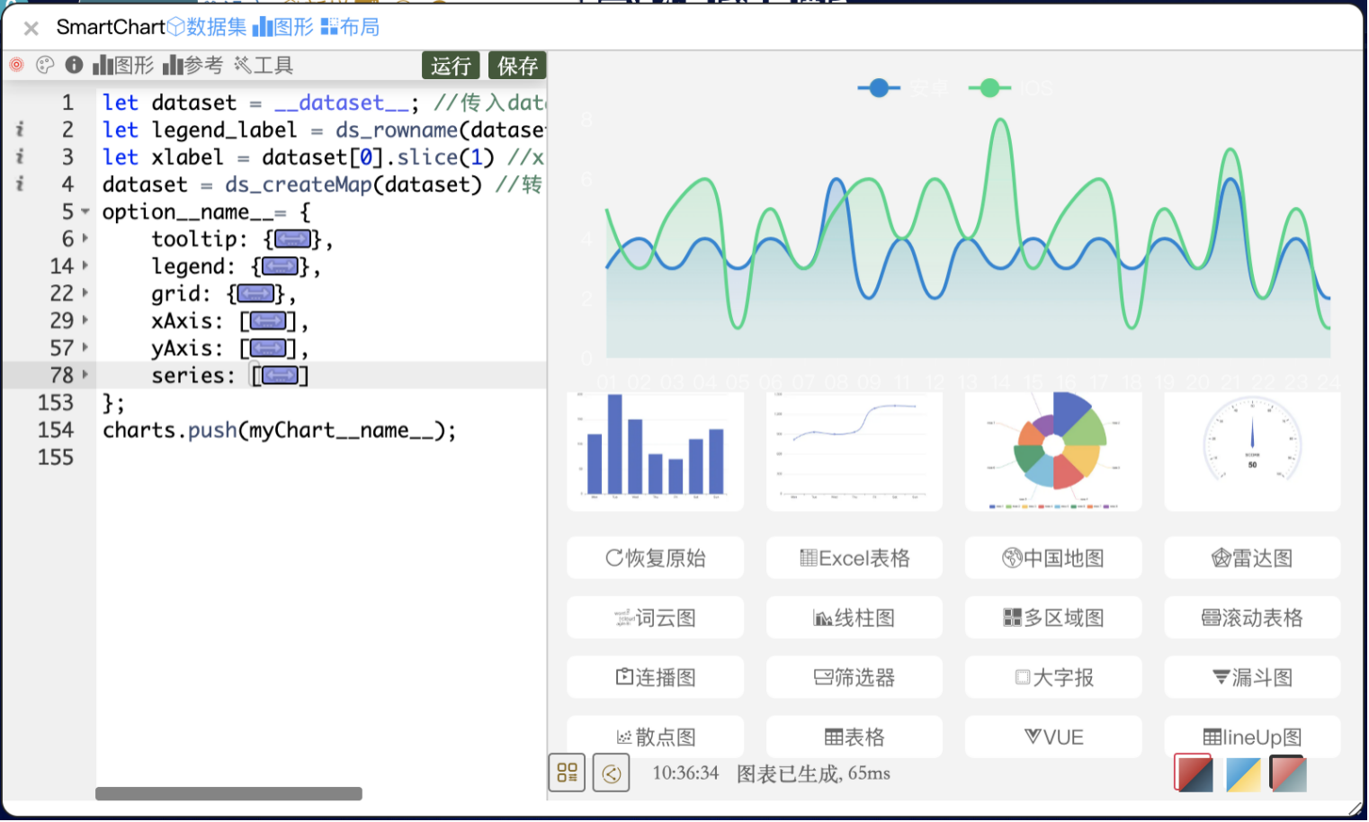
SmartChart includes a rich set of basic graphic components with one-click application and quick customization.
- Select “Graphics” → “Basic Graphics” from the top menu, click any graphic to apply it to the current chart
- Find more community-contributed SmartChart graphic templates in the Graphics Store
- Built-in basic graphics cover common types (bar, line, pie, etc.); simple configuration modifications can derive stacked charts, area charts, dual-axis charts, and other variants
Understanding ECharts Core Concepts #
SmartChart’s graphic configuration is entirely based on ECharts option. Understanding these core concepts will help you get started quickly.
Series #
Series is the core of graphics, defining “what chart to draw and what data to use.” Each chart type (bar, line, pie, scatter, etc.) corresponds to a series type (type: 'bar', type: 'line'…).

Components #
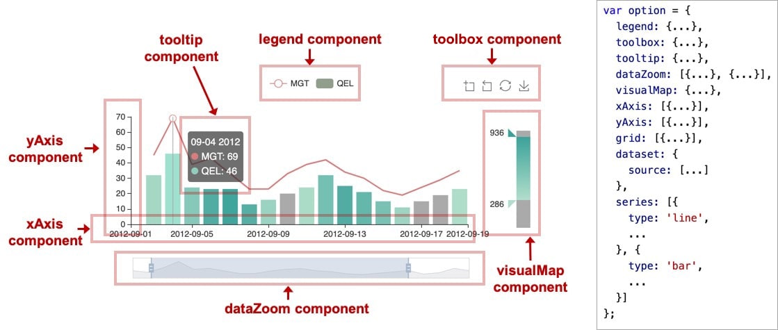
ECharts abstracts each element of a chart as a “component.” Common components include:
| Component | Purpose |
|---|---|
xAxis / yAxis |
X/Y axes of rectangular coordinate system |
grid |
Rectangular coordinate baseboard (controls chart area position and size) |
legend |
Legend (series name labels) |
tooltip |
Tooltip (shows data on hover) |
toolbox |
Toolbar (download, switch chart type, etc.) |
dataZoom |
Data zoom (drag to filter data range) |
visualMap |
Visual mapping (maps data to color, size, etc.) |
geo |
Geographic coordinate system (maps) |
Component Positioning #
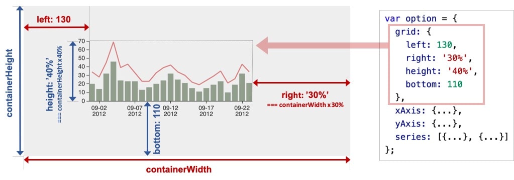
Most components support top / right / bottom / left / width / height for precise positioning (coordinates relative to the ECharts container):
- Absolute pixels:
bottom: 54means 54px from the container’s bottom edge - Percentage:
right: '20%'means 20% from the container’s right edge
Coordinate Systems #
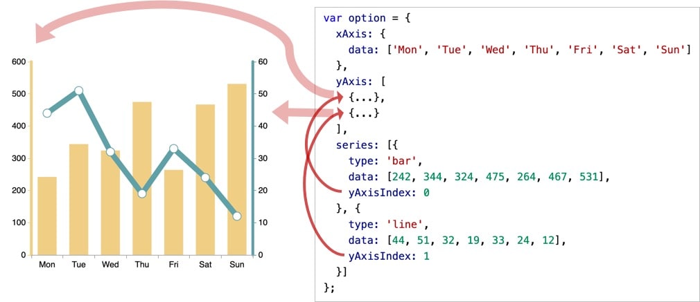
Different series types correspond to different coordinate systems (rectangular, polar, geographic, etc.). A single chart can contain multiple coordinate systems simultaneously.
Quick Apply Configuration Items #
Find common configuration item snippets in the graphic editor’s “Reference” menu — copy and use directly.
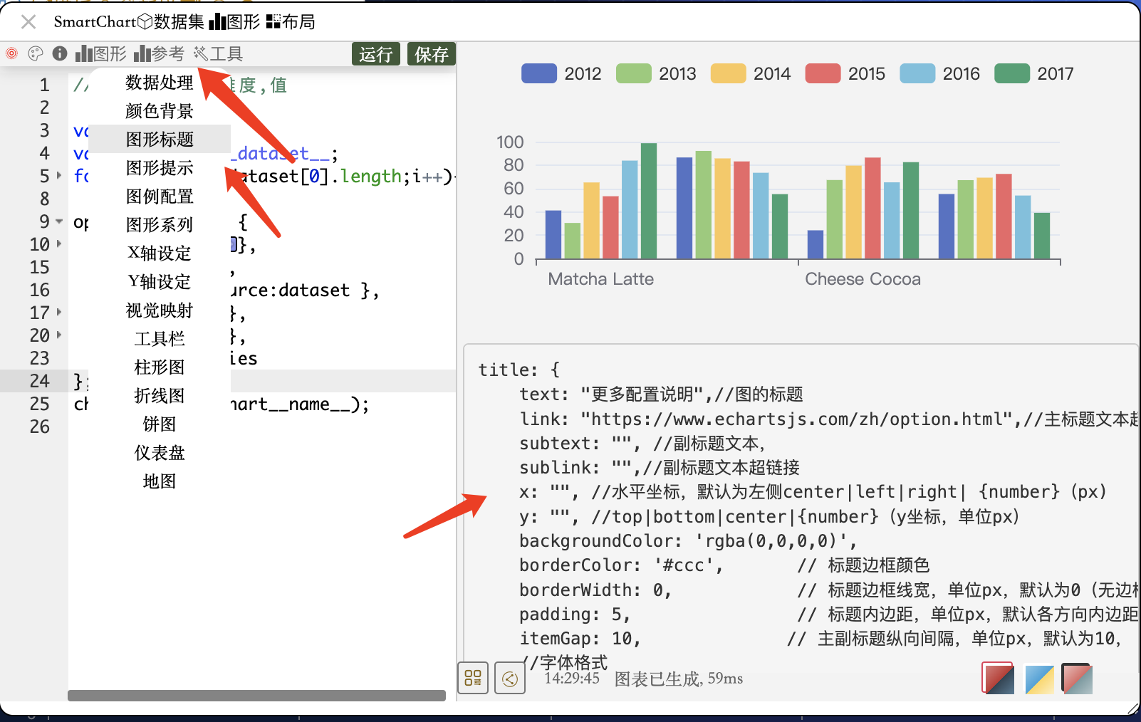
- ECharts has a rich set of configuration items — see the ECharts Cheat Sheet for the complete list
- You can also use AI to get configuration methods. Recommended prompt:
I need to set the ECharts title font color to red. Please provide only the corresponding ECharts configuration item.
Note: Avoid hard-coding colors and styles in code. Use Graphic Themes for unified settings to facilitate future style replacement.
Converting ECharts Official Examples to SmartChart Graphics #
Step 1: Get the Native ECharts Example #
Go to
ECharts Official Examples and find the target chart. Copy its option code.
Example with a simple bar chart ( view example):
option = {
    xAxis: {
        type: 'category',
        data: ['Mon', 'Tue', 'Wed', 'Thu', 'Fri', 'Sat', 'Sun']
    },
    yAxis: {
        type: 'value'
    },
    series: [{
        data: [120, 200, 150, 80, 70, 110, 130],
        type: 'bar'
    }]
};
Step 2: Convert to SmartChart Graphic #
Paste the option code into the SmartChart graphic editor, then click “Tools → Convert to SmartChart” for automatic initial conversion.

After automatic conversion, replace static data with dynamic datasets using the standard pattern:
let dataset = __dataset__              // Receive 2D array from backend
let legend_label = ds_rowname(dataset) // Auto-get legend labels (dimension list)
let xlabel = dataset[0].slice(1)       // X-axis labels (field names except first column)
dataset = ds_createMap(dataset)        // Convert to key→[] dictionary format

// Manually define series (mixed chart, e.g., bar + line)
let series = [];
series.push({
    data: dataset[legend_label[0]],    // First series data
    type: 'bar'
});
series.push({
    data: dataset[legend_label[1]],    // Second series data
    type: 'line'
});

option__name__ = {
    xAxis: {
        type: 'category',
        data: xlabel
    },
    yAxis: {
        type: 'value'
    },
    series: series
};
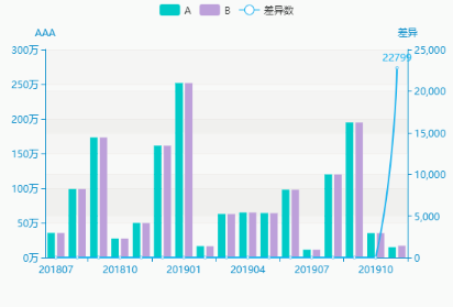
Preview (bar + line mixed chart):
Step 3: Add More Configuration Items #
Enrich the chart by adding title, legend, tooltip, etc. to the option:
option__name__ = {
    title: {
        text: 'Custom Chart Example',
        left: 'center'
    },
    tooltip: {
        trigger: 'axis',
        formatter: '{a} <br/>{b} : {c}'   // Tooltip format: series name + category + value
    },
    legend: {
        left: 'left',
        data: legend_label                 // Legend auto-takes dimension labels
    },
    xAxis: {
        type: 'category',
        data: xlabel
    },
    yAxis: {
        type: 'value'
    },
    series: series
};
Auto-generate Series (Multi-series Generic Pattern) #
When the number of series is not fixed, use a loop to auto-generate:
// After dataset is converted to ds_createMap format, auto-generate by legend_label
let series = [];
for (let name of legend_label) {
    series.push({
        name: name,
        data: dataset[name],
        type: 'bar'
    });
}

// Or auto-generate based on original 2D array column count (more concise)
let series = [];
for (let i = 1; i < dataset[0].length; i++) {
    series.push({ type: 'bar' });
}
// Use with ECharts dataset — no need to manually specify data
option__name__ = {
    dataset: { source: __dataset__ },
    xAxis: { type: 'category' },
    yAxis: { type: 'value' },
    series: series
};
Common Troubleshooting #
Graphic displays in editor but not in dashboard after saving #
Check the following in order:
-
Variable names not replaced: Check if
myChartandoptionin the code are replaced with__name__suffix forms:// Wrong myChart.setOption(option) // Correct myChart__name__.setOption(option__name__) -
Multiple setOption calls: If the code manually calls
setOption, add it after the option definition:myChart__name__.setOption(option__name__) -
Variable declaration conflicts: If the code has
let data = xx, change to assignment withoutlet:// Wrong (let scope issue) let data = dataset // Correct data = dataset