Introduction #
SmartChart provides two layout methods: drag-and-drop layout (absolute positioning, for large screens) and grid layout (responsive, for reports/mobile), which can be mixed. Understanding container hierarchy and selector naming is key to mastering layout.
Recommended video: SmartChart Layout
Container Overview #
| Container | Description |
|---|---|
| Positioning Container | Used for chart positioning, available in drag and grid modes. Auto-generated when adding from UI; manually added in template editing |
| Chart Container | Used for chart selection via ID selector, e.g., container #2 selector is #container_2 |
| Chart | The actual visualization unit, e.g., select table tag in chart: #container_2 table |
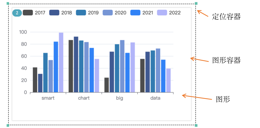
CSS/JS container selection patterns:
/* Adjust chart container styles in CSS */
#container_2 { border: 1px solid #fff; }

/* Operate container in JS */
$('#container_2').css('display', 'block');
$('#container_2 canvas').attr('width', 500);
Drag-and-Drop Layout #
- Use absolute positioning via drag to freely specify chart positions
- Reference: Drag Tutorial
- Combine with “Template Development” for highly customized effects, see Template Dev Guide
- Default positioning height is dynamic. For fixed-height components, enable fixed height in Settings -> Advanced Settings
- For component layering, specify z-index in container settings:
style="z-index:11;"- CTRL+click for multi-select and move, or use arrow keys
- Click lock then toggle to enable mouse selection area move
Responsive Drag #
- Implement different layouts for desktop and mobile on the same dashboard
- Switch browser width below 750px to drag and save mobile layout
- Click the phone icon in dev interface to switch to mobile drag mode

Grid Layout #
When adding a grid chart, the layout editor provides default code:
<div class="el-col-xs-24 el-col-md-24" style="padding:0.2rem;height:50%;" >
  <div style="height:100%;" id="container_{name}"></div>
</div>

el-col-md-24 : Desktop width setting
Controls chart parent container width, full row divided into 24 columns. For half width use el-col-md-12
el-col-xs-24 : Mobile width setting
padding:0.5% 0.5%:
Controls top/bottom, left/right padding. E.g., padding: 1% 0 0 0 to move chart down
height:50%;
Box height relative to parent container, outermost is browser height
Grid width reference:
| Grid value | Proportion | Use case |
|---|---|---|
| el-col-md-24 | 100% | Full width banner |
| el-col-md-12 | 50% | Two columns side by side |
| el-col-md-8 | 33% | Three columns side by side |
| el-col-md-6 | 25% | Four columns side by side |
Mixed Layout (PRO) #
Consider using responsive layout for the overall framework, then add decorations with absolute positioning (drag layout)
Chart Lazy Loading (Hidden Layout) #
- Control chart display programmatically using lazy-load datasets
- Lazy-load datasets don’t have layout in template, but you can customize layout
- For dataset 2 (lazy-load, edited chart), add placeholder in template:
<div style="height:100%;display: none" id="container_2"></div>
Then manually trigger chart display, e.g., via button click:
$('#id_button').click(()=>{
    $('#container_2').css('display', 'block');
    ds_refresh(2);
})